Danh Vo: Untitled, 2019
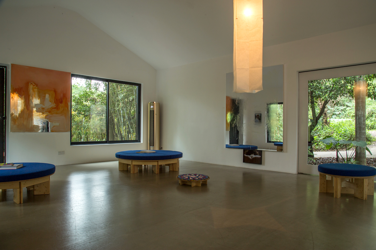
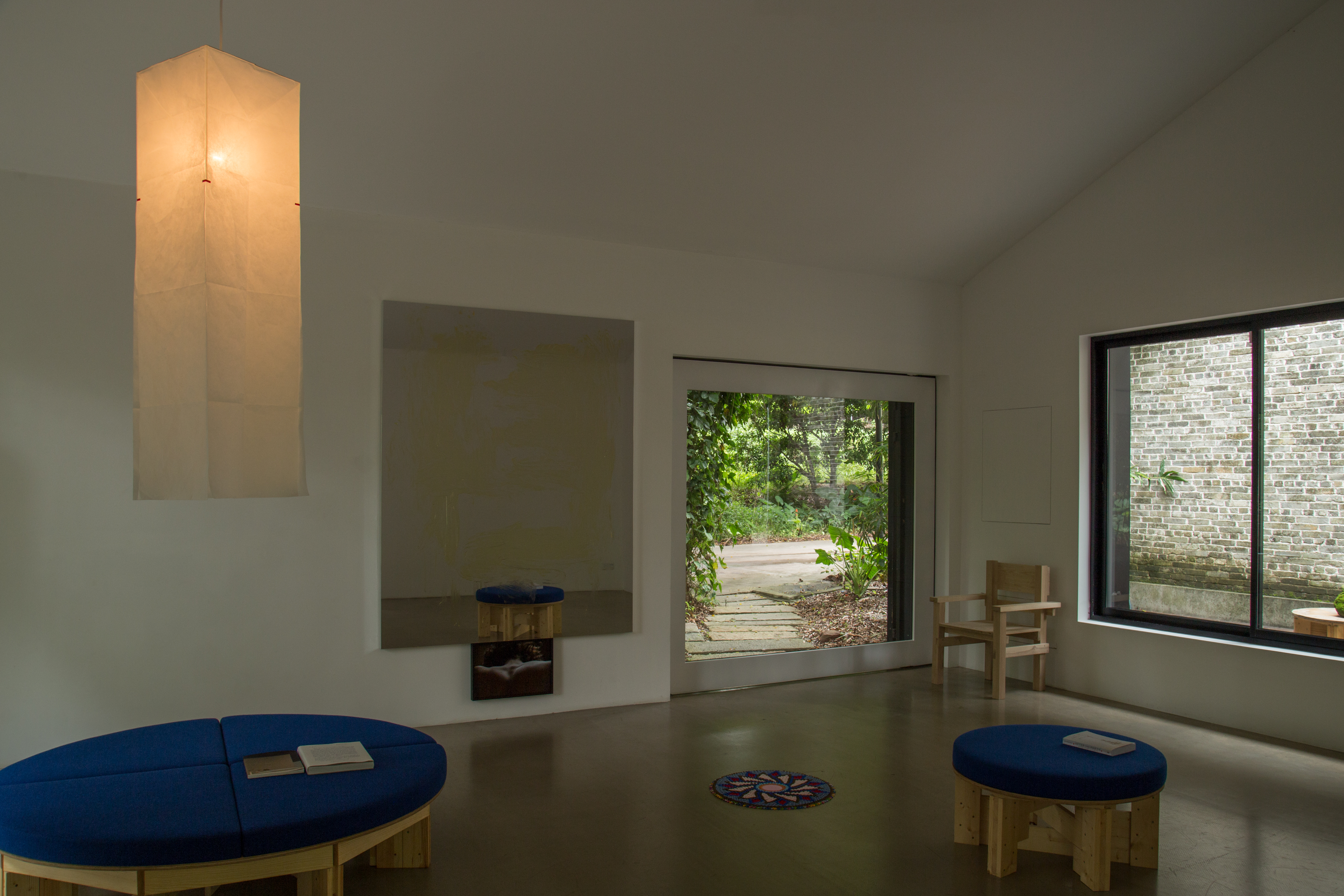
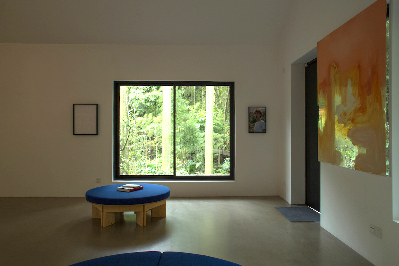
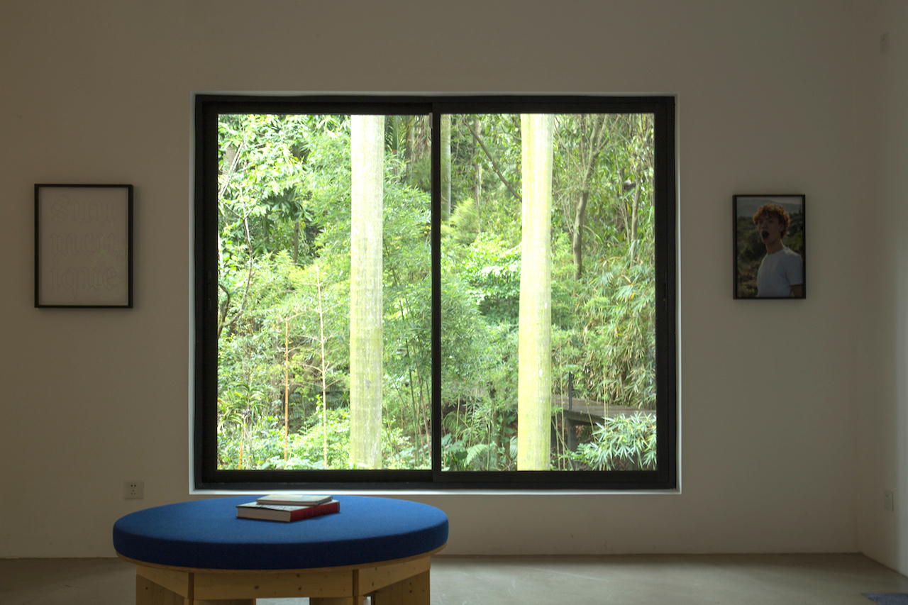
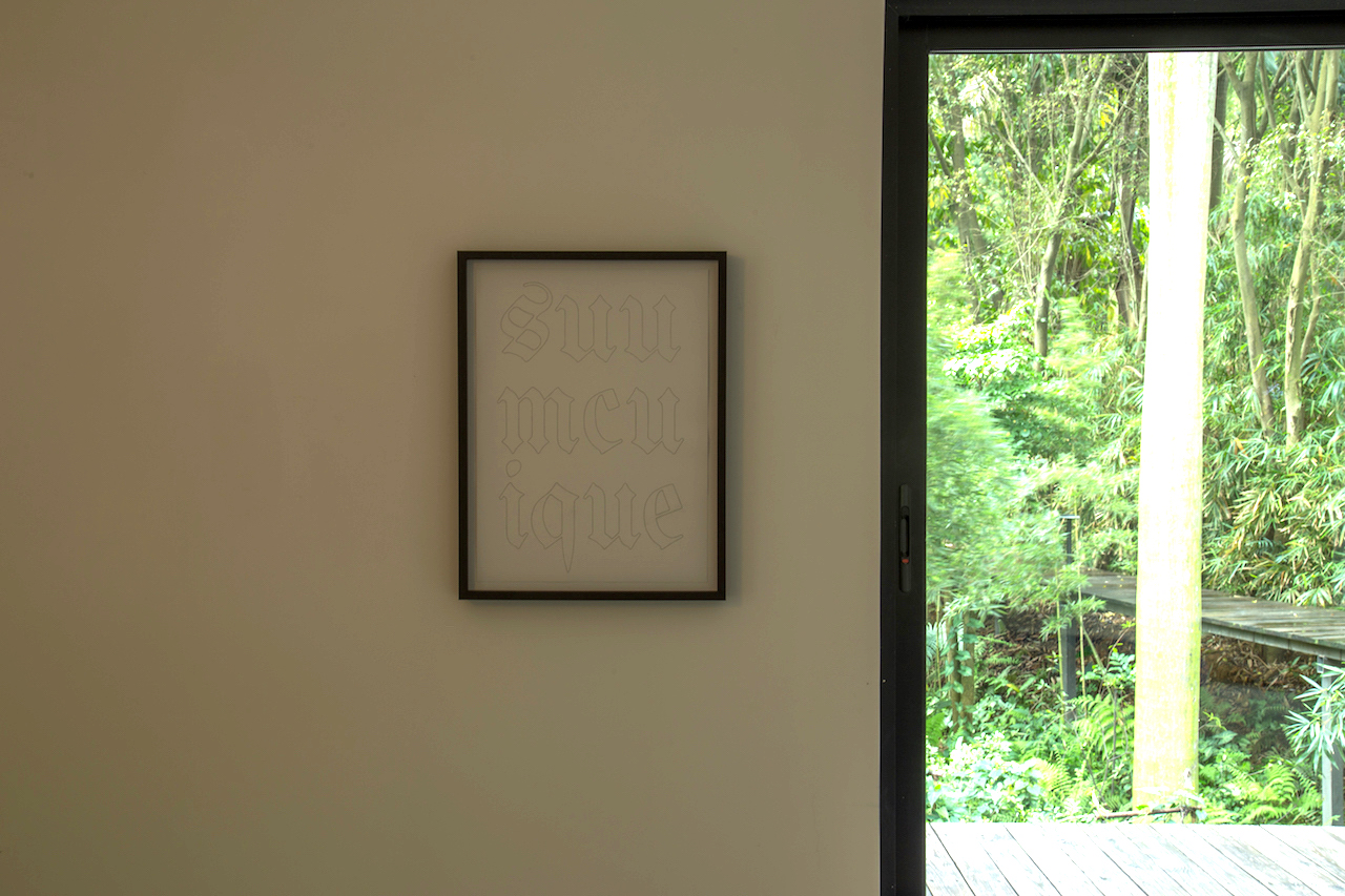
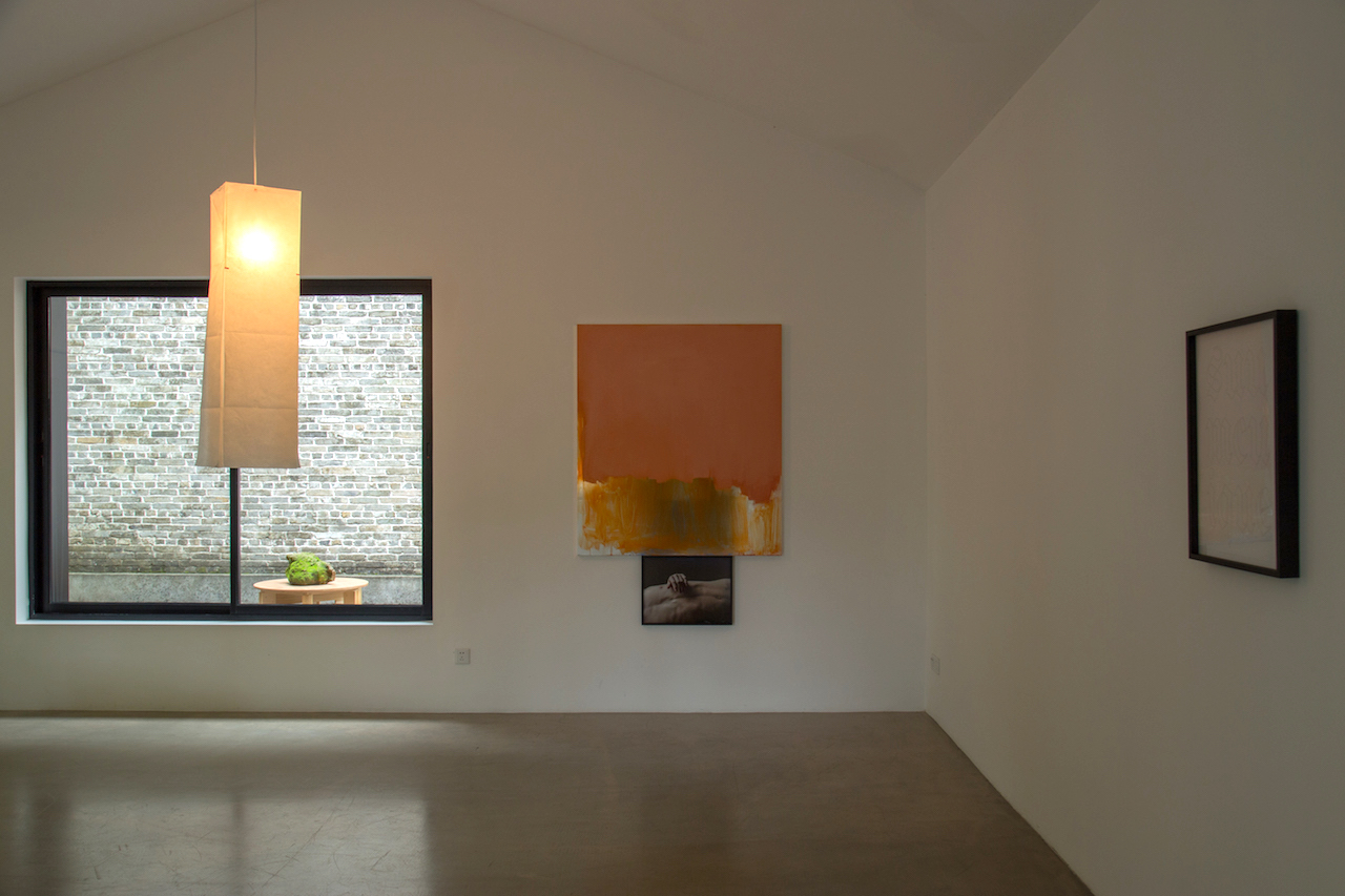
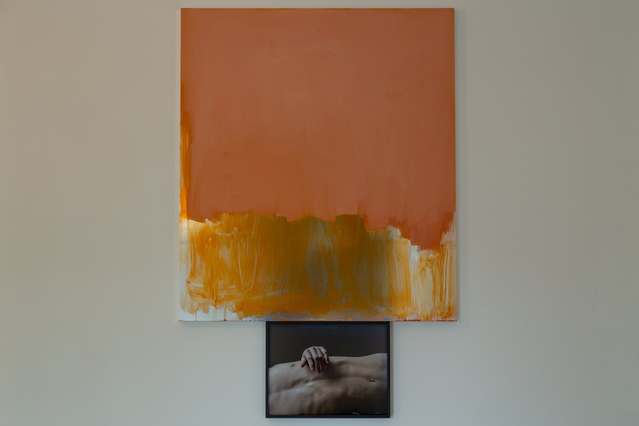
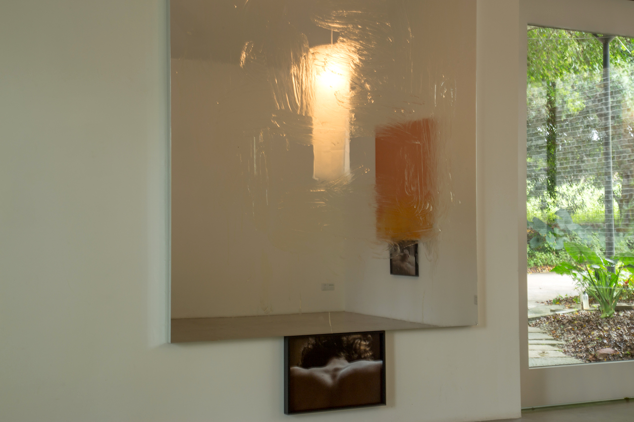
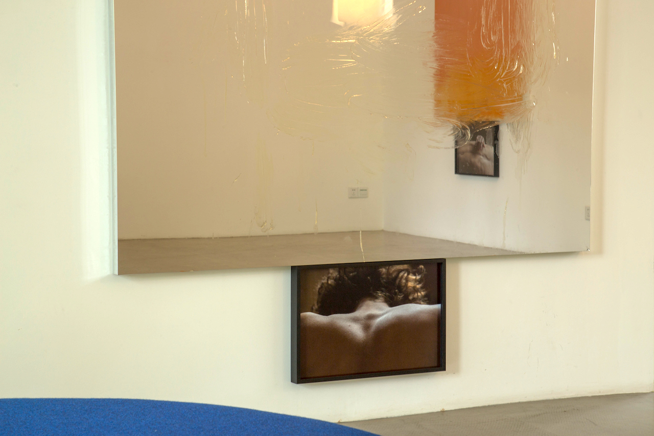
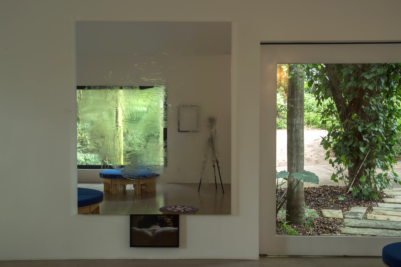
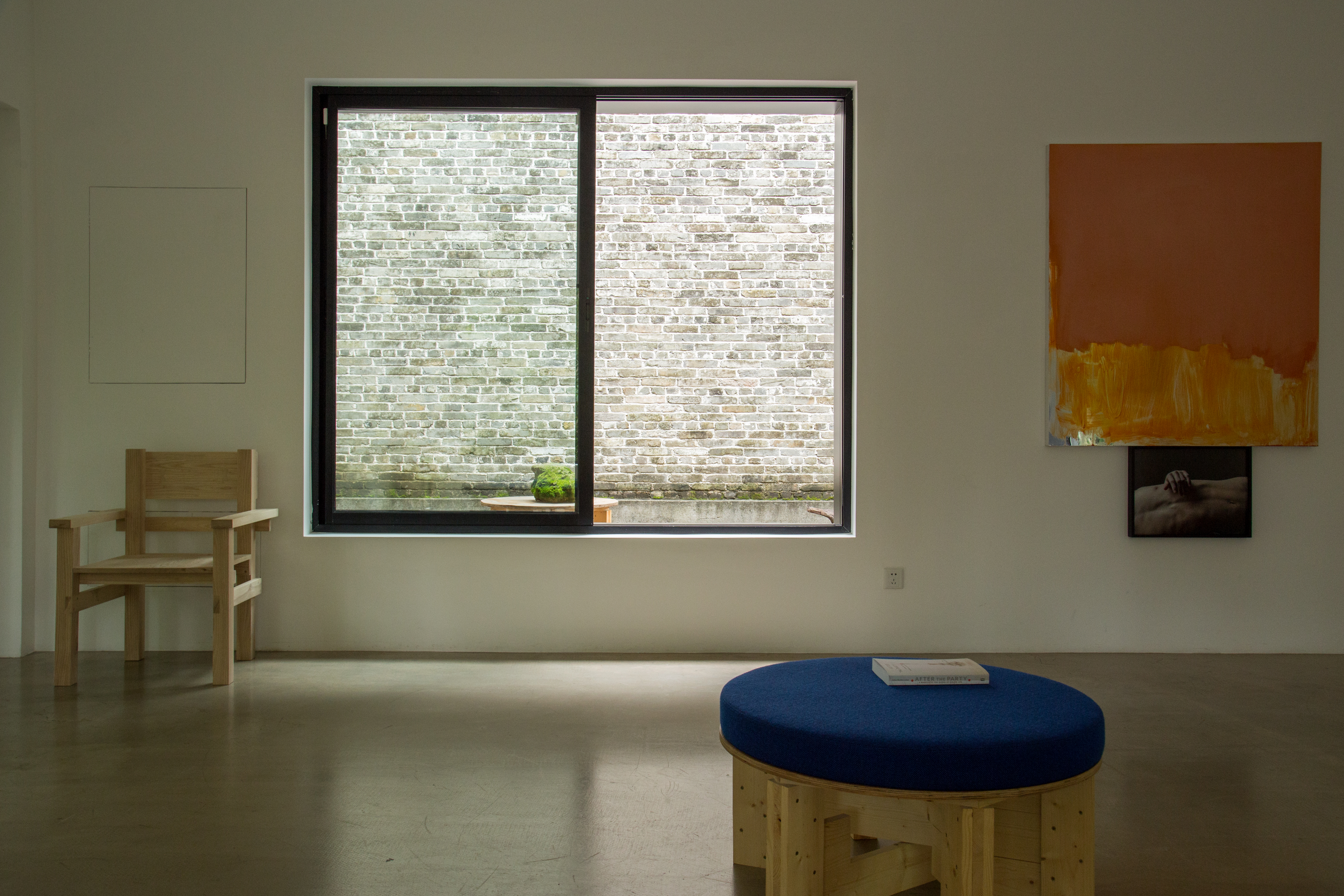 Exhibition view of “Danh Vo: Untitled” at Mirrored Gardens, Guangzhou, 2019
Danh Vo: Untitled
2019
Painting by Peter Bonde; photograph of Danh Vo´s nephew Gustav by Heinz Peter Knes; writing by Phung Vo, pencil on paper; fabric by Nanna Ditzel and furniture based on design by Enzo Mari´s Autoprogettazione
Variable dimensions
The Calligraphy:
 Perhaps the most chilling design completed for the Nazi’s by Bauhaus artist Franz Ehrlich was the cool sans serif lettering for the text embedded in the gates to Buchenwald, “Jedem das Seine.” The words were derived from a Roman legal maxim, “suum unicuique,” referring to the individual’s right to enjoy what is his. “To each his own” was appropriated and bent by the Nazis to convey that everyone gets the fate he deserves. Vo’s father Phung Vo has hand-written the text in his preferred font, and both meanings, braided with their diverse layers of historical entanglement and Vo’s own biography, are in play here simultaneously.
The Photographs:
 Vo’s Danish-born nephew Gustav has served as an occasional muse. Gustav’s Wing (2012) is a photograph of the subject as young boy, near classical in his pose, his naked back emphasizing the double-jointed shoulder blade that appears as an angel’s wing. A slightly later work Gustav’s Wing (2013) cast the boy’s body in six bronze parts then welded them together in a violent heap. If this work is a memento mori of sorts, the photographs of Gustav on display in this work show a confidant and self-realized individual. Taken by Vo’s lover and collaborator, artist Heinz Peter Knes they flirt with conventions of fashion photography, engaging the model as sculptural form and intimate friend. Where Vo’s work often looks backwards, here Gustav, as a member of the new generation, becomes a living embodiment of hope.
The Paintings:
 The Danish artist Peter Bonde has deployed gestural abstraction for some three decades, creating process-based paintings that in recent years have been applied to mirror foil surfaces. The meanings of these dysfunctional mirrors are ambiguous, dissolving, never-formed – is the artist painting on the mirror as surface or everything reflected in it? A virtuosic colorist, Bonde’s gestures shimmer as if floating. Vo’s Self-portrait (Peter), 2005 presents a letter received from Bonde, then a professor at the Royal Danish Academy of Fine Arts, recommending that Vo quit painting. Bonde’s postition on Vo as painter was reciprocated by the young Queer student who saw his tutor’s paintings as symbols of macho excess. Some years later, with the shifting ideologies of art and time, Vo was struck by a painting by Bonde that he happened upon, and requested paintings for the work here.
The Fabric:
 Of Nanna Ditzel’s – the “First Lady of Scandinavian Design” – many iconic designs, the fabric Hallingdal has been in continuous production since 1965. Archetypal in its simplicity, Hallingdal is a balanced plain weave that combines two colors of wool and viscose yarn in an extremely durable construction. In describing Hallingdal’ s durability, Anders Byriel, Kvadrat’s CEO, uses the colloquial term hufterproof, a Dutch expression for “virtual indestructibility,” and adds, “We don’t make products like this anymore.” Hallingdal has been restored to Ditzel’s original color palette from 1965, the fabric comes in 58 colourways. The versatile palette includes neutral and strong, primary colours, as well as the designer’s favourite hues: turquoise and pink. And although Nanna Ditzel once remarked that “if a design is timeless, it is never relevant,” she would surely be gratified to see herself proven wrong.
The Furniture:
 “Enzo Mari is right, everyone should do design: after all, it is the best way to prevent yourself from being designed.” ( G.C. Argan, 1974) The design practice behind Enzo Mari’s autoprogettazione (or “self design”), presented in 1974, is an emphatic return to the basic needs of humans, suggesting a reversion to an active relationship with the material world. By the word autoprogettazione Enzo Mari means an exercise to be carried out individually to improve one’s personal understanding of the sincerity behind the project. To make this possible you are guided through an archetypal and very simple technique. Therefore the end product, although usable, is only important because of its educational value.
Vo declares jovially that he wants to “attack the world with an army of love,” but his army is ghostly, the beautiful and disgraceful dead and the dead in the living: Ehrlich’s chairs dialogue with artistic mediums rather than Nazi interiors; Gustav’s twisted bronze returns as emancipated and self-aware youth; the impossible impasse between painter and student is side-stepped; and personal drawings reclaim Nazi-approved typography to allow a text to exist anew. Too stubborn to be a statement for Utopian diversity, these various autonomies nevertheless co-exist as implicated and pragmatic alternatives to whatever is coming next.

It’s not that I’m trying to say all these interests I have make sense…often the only direct link is through my life…from whatever encountered me or whatever I encountered. To put all these together…that’s the only thing I basically can do, but I have to trust it because that’s my life.
——Danh Vo, 2018
Text: Danh Vo’s studio, The Pavilion
Photo: Wen Peng, Vitamin Archive
© The Artist, The Pavilion, 2019